Designing a digital bank for Pakistan, from the ground up
ROLE
Lead Product Designer
Duration
6 months
Team
2 Product Designers
2 UX Researchers
1 UX Writer
2 UX Researchers
1 UX Writer
SKILLS
Product Design
Product Strategy
Prototyping
Product Strategy
Prototyping
The problem
As of June 2022, 76% of Pakistan's 230 million people were unbanked. Not because they don't want access to financial services, but because the existing system makes it too hard, too slow, and too intimidating to participate in.
Traditional banks require extensive documentation, week-long processes, and physical branch visits. The conventional banking apps that exist are slow, confusing, and riddled with broken flows, as their app store reviews make painfully clear.
Dbank set out to change that. The goal was simple: build a digital banking app that anyone in Pakistan could open, use, and trust, from a Bykea rider in Karachi to a young professional planning their future.
Traditional banks require extensive documentation, week-long processes, and physical branch visits. The conventional banking apps that exist are slow, confusing, and riddled with broken flows, as their app store reviews make painfully clear.
Dbank set out to change that. The goal was simple: build a digital banking app that anyone in Pakistan could open, use, and trust, from a Bykea rider in Karachi to a young professional planning their future.
Field research across markets and neighborhoods
Understanding the landscape
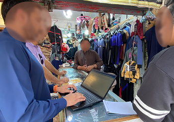
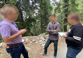
We spent time understanding the problem space before anything else. We went out into the field, talking to people in markets and streets across Pakistan, and combined that with a deeper analysis of existing banking and mobile wallet apps in Pakistan.
Limited access and low awareness
Most people had never engaged with formal banking at all, not because they didn't want to, but because the system made it feel inaccessible, complex, and irrelevant to their lives.
The apps existed, but weren't working
Broken onboarding flows, late OTPs, vague error messages, and outdated interfaces left users frustrated and distrustful, even when they tried.
Trust was the biggest barrier
In a market where people are already skeptical of formal financial systems, a single bad experience was enough to push someone away for good.
But the appetite was clearly there
Mobile wallets were growing at 72% year over year. People wanted digital financial access, they just hadn't found something they could actually use and trust.
The Big question
Most of Pakistan had never banked before. The few who tried were let down by apps that broke at every step.
So the real question wasn't how to build another banking app. It was: how do you design for someone who has never used a bank, and earn their trust with the thing they protect most, their money?
That question shaped everything we designed.
Users we designed for
We built three personas based on our research, each representing a real segment of the people Dbank was trying to reach.

Abbas
Bykea rider
Abbas earns daily but has no way to save or secure his money. He's tried opening a bank account before but gave up halfway through the documentation process. He needs something fast, simple, and trustworthy, with no paperwork that makes him feel like a second-class customer.

Fatima
Young Physician
Fatima is busy, financially capable, and tech-savvy, but her schedule makes it impossible to visit a bank branch. She needs a loan to support her brother's education and wants the entire process to happen on her phone, on her time.

Haziq
Graduating CS student
Haziq is about to start his first job and planning to get married. He needs financial products that match where he is in life, savings tools, credit access, and an app that doesn't treat him like he needs a finance degree to use it.
How we worked
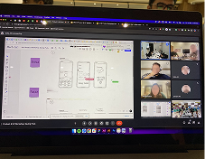
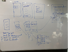
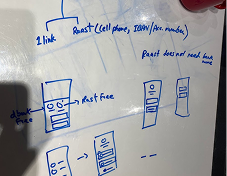
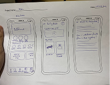
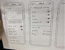
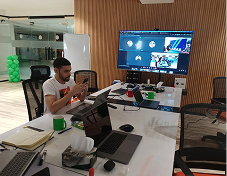
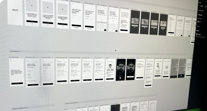
From rough sketches and whiteboard sessions to low-fidelity wireframes, we worked through the flows collaboratively before committing to anything in high fidelity. The goal was to get alignment on structure and decisions early, so that by the time we moved into Figma, everyone was already on the same page.
Early brainstorming & ideation
The Solution
Onboarding
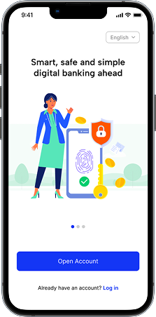
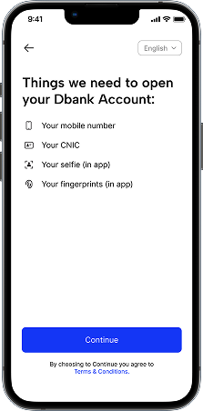
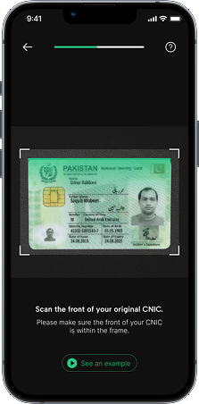
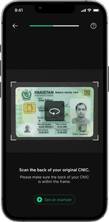
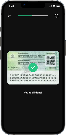
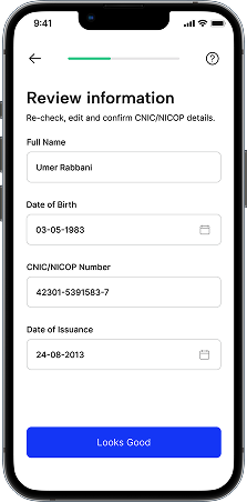
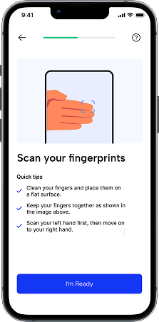
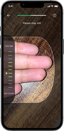
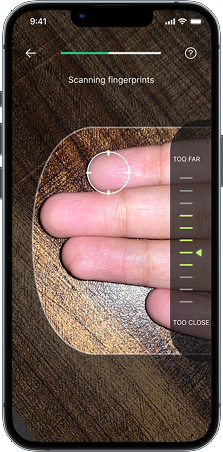
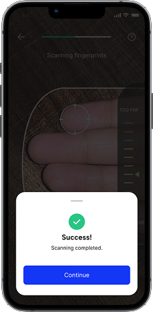
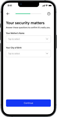
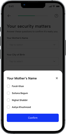
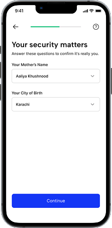
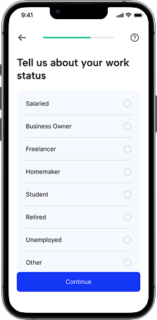
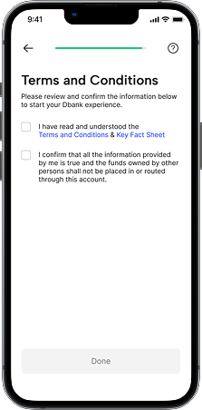
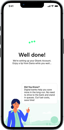
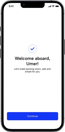
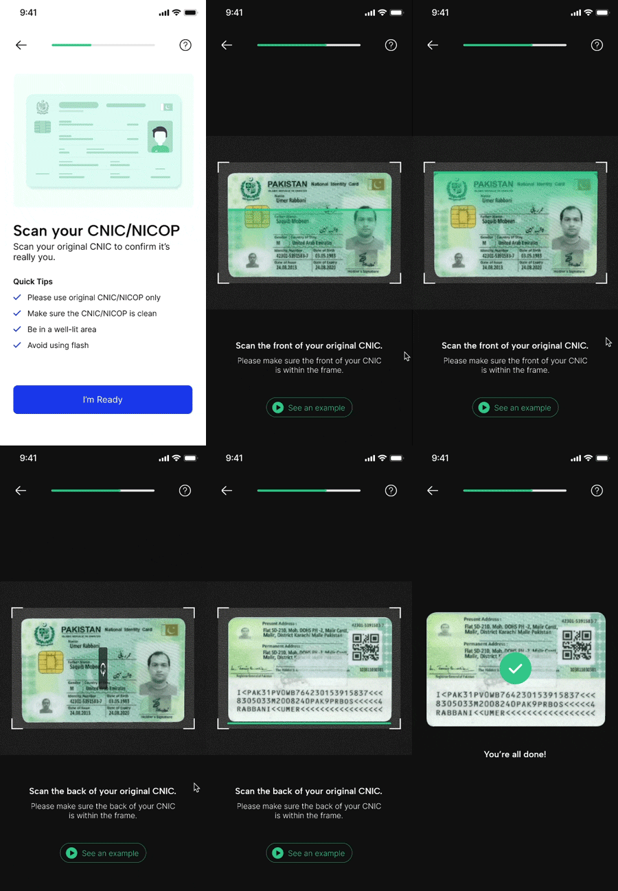
The biggest drop-off point in every competing app. We designed the entire flow around one principle, reduce friction at every step without compromising SBP security requirements. OCR auto-population eliminated manual data entry, clear upfront expectations set the right tone from the start, and real-time guidance through biometric verification turned a week-long process into minutes.
Welcome & phone number verification
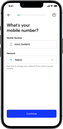
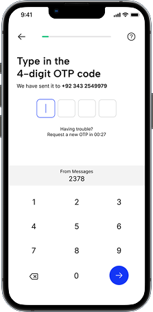
ID Verification
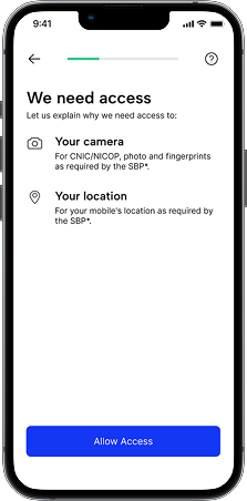
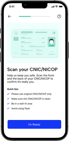
Finger Print Scan
Liveness Testing
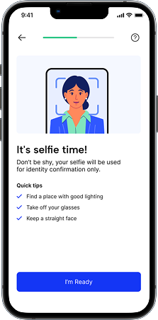
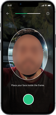
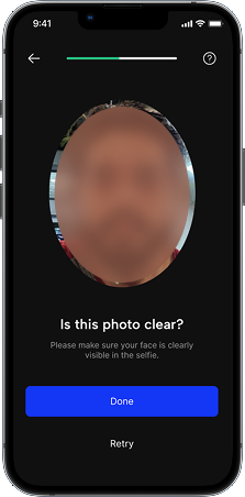
Security Verification & Welcome
Home
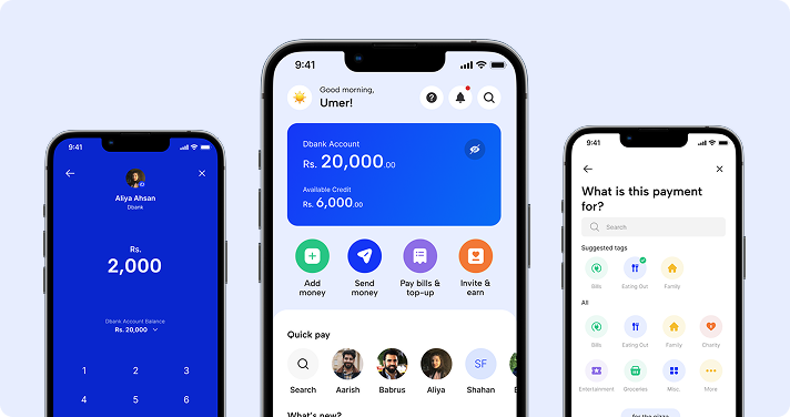
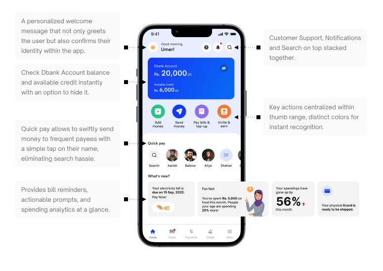
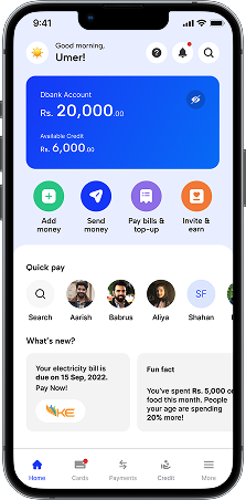
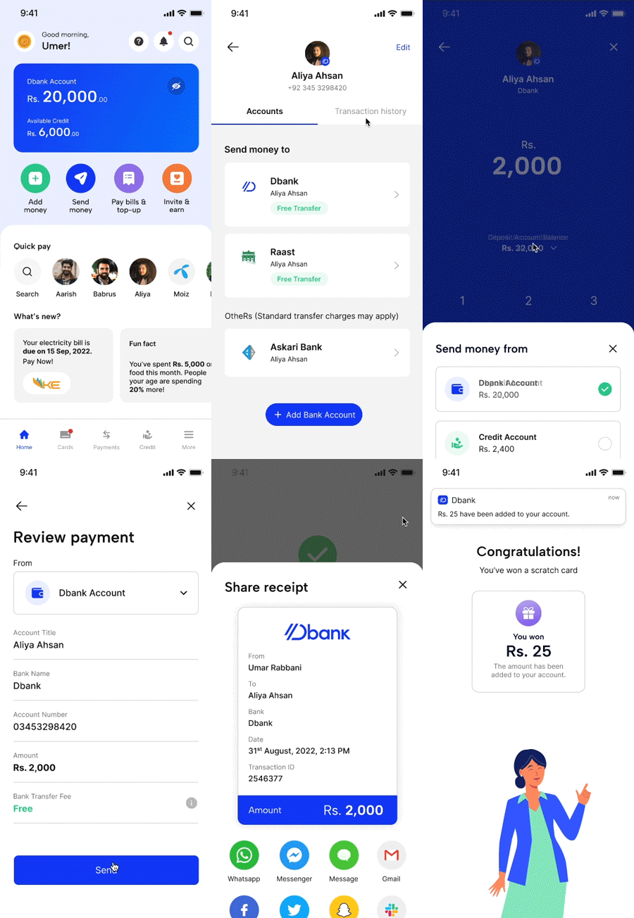
The home screen was designed to give users everything they needed at a glance, balance, quick actions, recent activity. without overwhelming them. Key actions were placed within thumb reach, color-coded for instant recognition, and a quick pay feature let users send money to frequent contacts in a single tap.
Send Money
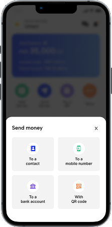
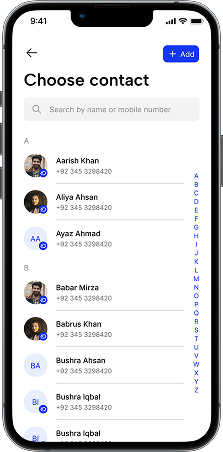
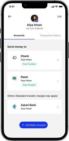
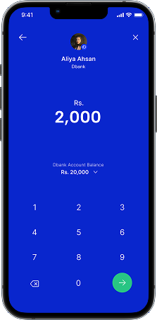
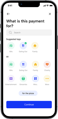
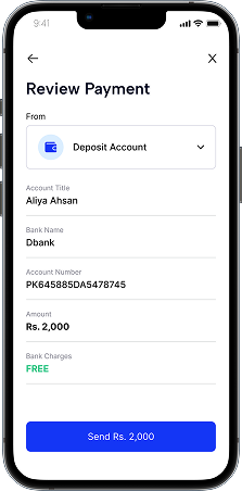
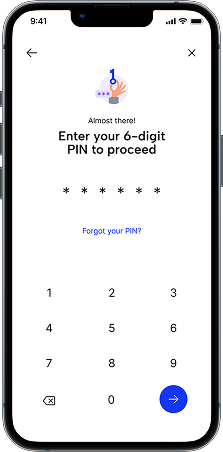
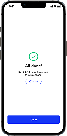
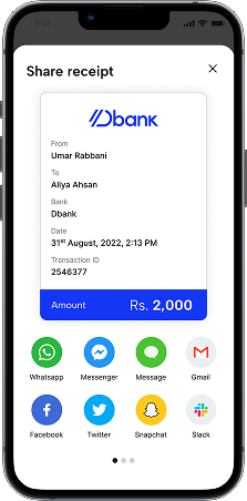
We designed the send money flow around a one-step-at-a-time approach to minimize cognitive load. Emphasis was placed on Dbank to Dbank and RAAST transfers to highlight fee-free options upfront. Payment tagging was added to help users track spending over time, and a shareable receipt with scratch card rewards turned a transactional moment into a delightful one.
Picking Up a Contact
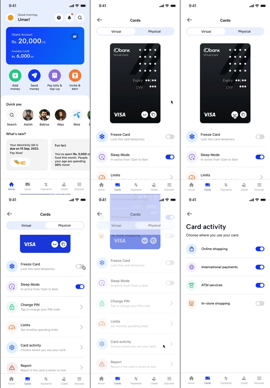
Sending money
Cards
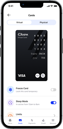
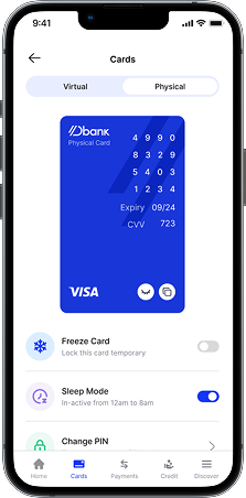
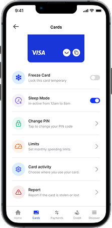
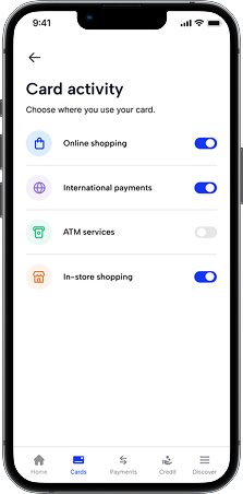
The cards section gave users full control over both their virtual and physical debit cards, freeze, sleep mode, spending limits, card activity restrictions, and PIN management all in one place. The goal was to make users feel like they owned their card, not the other way around.
Prototypes
Static screens only tell half the story. Here are the core flows in motion, exactly as users would experience them.
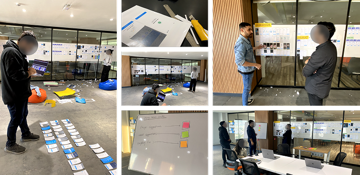
The Open House
Once the major flows were ready, we set up an open house, every screen, every flow, laid out across the conference room walls for the entire organization to see. We then held a full-day session for everyone to come together, explore the designs, discuss ideas, and debate direction. It was one of the most energizing days of the project, and some of the sharpest insights came from people we hadn't expected to weigh in.
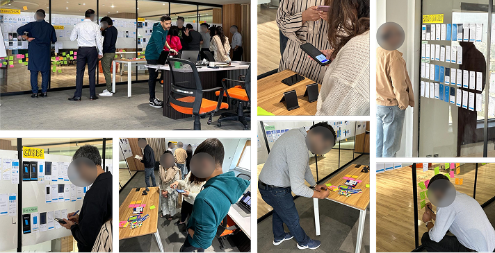
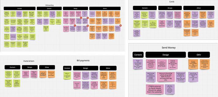
Feedback Collected
A snapshot of everything that came out of the session, feedback, questions, and ideas organized by feature, straight from the people.
Key Learnings
Trust is everything in fintech.
Users will abandon a flow the moment something feels off, a vague error message, an unexpected screen, a transaction that doesn't confirm clearly. Every micro-interaction is a trust signal. We learned to treat clarity and transparency not as nice-to-haves but as core design requirements.
Designing for the unbanked means designing for unfamiliarity.
A lot of our users had never used a banking app before. Patterns that feel obvious to a designer, or even a regular smartphone user, needed to be explained, guided, and reinforced. Assumptions are expensive in this context.
Getting the whole organization involved makes the work better.
The Open House brought perspectives to the table that no internal product review could replicate. When everyone has a chance to engage with the work, the ideas and feedback you collect are richer, more diverse, and often surprising.
Not every product ships, and that's okay.
Dbank did not receive its Digital Retail Banking license from the State Bank of Pakistan. What this project gave me, more than anything, is the experience of designing a financial product from the ground up, for people who have never had access to one before.